
Operating System
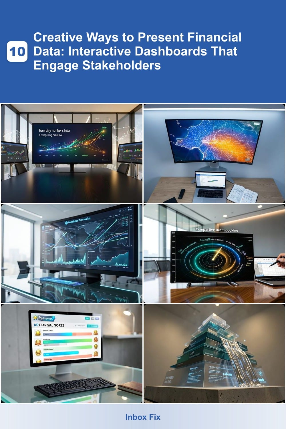
Boring spreadsheets won’t cut it anymore. These 10 creative financial data visualization techniques transform complex numbers into engaging, interactive dashboards that captivate stakeholders and drive better decisions—without requiring advanced coding skills.
Animated Storytelling Financial Timelines

Tired of static spreadsheets that make investors nod off? Animated Storytelling Financial Timelines turn dry numbers into a compelling narrative—think motion graphics that highlight milestones, growth phases, and turning points with smooth transitions.
Tools like Tableau or Power BI let you embed GIF-style animations that show revenue spikes, expense reductions, or funding rounds as interactive progress bars. Add color-coded phases (e.g., red for losses, green for profitability) and voice-over narration to guide viewers through key insights—ideal for pitch decks where context sells better than raw data.
Perfect for startups pitching to VCs or established companies presenting to boards, this approach turns financial reviews into a cinematic experience that sticks with stakeholders. ✨
Interactive Geographic Heatmaps

Tired of static spreadsheets when location matters? Interactive geographic heatmaps turn raw financial data into visual insights tied to real-world geography—ideal for spotting patterns in real estate, retail, or regional markets.
Tools like Tableau or Power BI let you overlay revenue, foot traffic, or profit margins onto maps, with color gradients highlighting high/low performers. Hover over any area to see real-time tooltips with exact numbers, and filter by time periods (e.g., quarterly trends). For developers, libraries like Leaflet.js offer customizable, lightweight solutions.
Perfect for franchise owners analyzing store performance or investors evaluating property portfolios, these maps turn abstract data into actionable spatial strategies. 🌟
AI-Powered Predictive Forecasting Charts

What if your financial dashboard didn’t just show past performance—but predicted what’s coming next? AI-Powered Predictive Forecasting Charts leverage machine learning to analyze historical data and project future trends, turning static numbers into actionable insights.
Tools like Tableau’s AI Forecasting or Power BI’s Azure ML integration automatically generate trend lines with confidence intervals, helping you spot emerging opportunities or looming risks before they materialize. No coding required—just upload your data, let the AI crunch the numbers, and watch as dynamic forecasts adapt in real time.
Perfect for startups testing new markets or data-driven companies refining strategies, these charts transform guesswork into data-backed decisions. ⚡
Comparative Benchmarking Radars

Tired of comparing spreadsheets line by line? Comparative Benchmarking Radars turn financial analysis into a clear, visual showdown. These dynamic charts plot your metrics—like profit margins, growth rates, or customer acquisition costs—against competitors or industry benchmarks, revealing strengths and gaps at a glance.
The best tools, like Tableau’s Radar Chart or Power BI’s Comparative Analysis, let you customize axes for ROI, market share, or operational efficiency, then overlay multiple companies in seconds. A single glance shows whether you’re leading in customer satisfaction but lagging in cost efficiency—no PhD in finance required. Exporting to PDF or PowerPoint keeps the insights polished for board meetings.
Perfect for CFOs, startup founders, or marketing teams needing quick, data-driven insights, these radars turn abstract numbers into actionable strategies. 🌟
Gamified Financial Scorecards
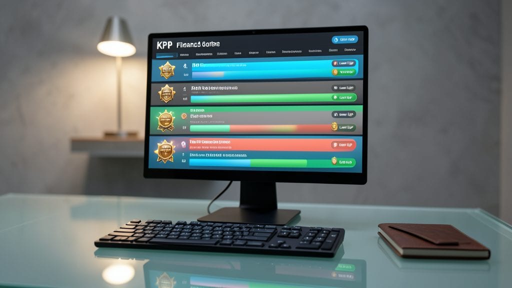
Tired of dry spreadsheets that make your team’s eyes glaze over? Gamified Financial Scorecards turn KPIs into a competitive leaderboard—complete with progress bars, achievement badges, and real-time updates to keep everyone motivated.
Tools like Smartsheet or Monday.com let you customize dashboards with color-coded performance metrics, team rankings, and even virtual rewards for hitting milestones. The drag-and-drop interface makes it easy to adjust targets, and integrations with CRM systems pull live data for accuracy. For sales teams, this approach boosts engagement by 30%+, according to Gartner.
Perfect for sales-driven organizations, remote teams, or startups where motivation and transparency are key. Watch your team’s productivity climb as they chase those top spots! ✨
3D Financial Data Sculptures

Tired of flat charts that make financial concepts feel abstract? 3D Financial Data Sculptures turn numbers into tangible, interactive models—like a debt pyramid or revenue stream waterfall—that stakeholders can rotate, zoom, and explore in real time.
Tools like Tableau’s 3D mapping or Blender + Python libraries let you craft depth-based visualizations where layers reveal hidden relationships. For example, a multi-tiered pyramid could show debt accumulation over time, with each segment color-coded by interest rate or maturity. The result? A presentation that sticks in minds far longer than a 2D pie chart. ⚡
Perfect for educators, investors, or executives who need to explain complex financial structures—especially when your audience responds better to spatial reasoning than spreadsheets. Try it for your next board meeting and watch engagement soar. 💻
Real-Time Collaborative Whiteboards

When financial brainstorming requires more than static slides or spreadsheets, real-time collaborative whiteboards turn passive observers into active participants. Tools like Miro or Microsoft Whiteboard let teams annotate live financial models, sketch revenue projections, or highlight cost-saving opportunities—all while seeing each other’s edits unfold instantly.
You get multi-user cursors (so everyone’s input is visible), integrated data visualization (embed charts or tables directly), and version history (to revert to earlier ideas). The zero-latency sync ensures no one gets left behind—critical for remote workshops where alignment matters most. Plus, template libraries for financial frameworks (like SWOT or PESTLE) speed up setup.
Perfect for CFOs leading cross-department strategy sessions or startup founders aligning investors on pivot strategies, these whiteboards replace endless email threads with live, visual collaboration. ✨
Sentiment-Color-Coded Financial Mood Rings
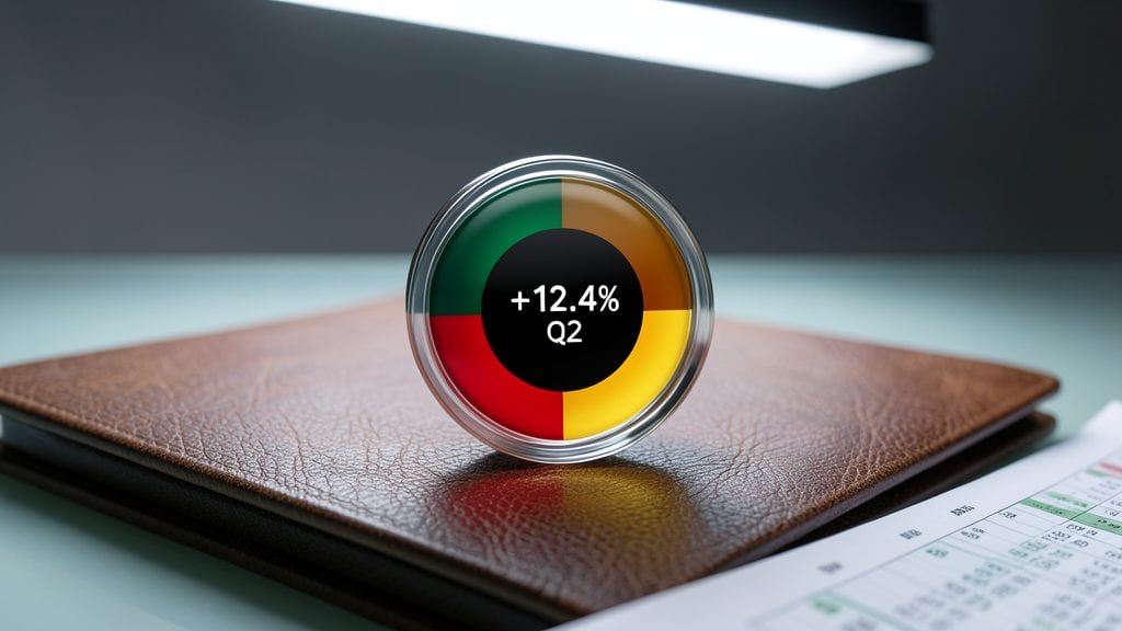
Tired of stakeholders glazing over spreadsheets? Sentiment-Color-Coded Financial Mood Rings turn numbers into intuitive visual cues—like a mood ring for your money. Instead of dry percentages, you see real-time color gradients (red for losses, green for gains, yellow for caution) that instantly communicate financial health at a glance.
This tool integrates with platforms like Tableau or Power BI to overlay sentiment analysis on key metrics. For example, a debt-to-income ratio might show as a deep blue ring when stable but flash red if crossing thresholds. The customizable thresholds let you define what "good," "neutral," or "risky" means for your business, while the circular design keeps focus on overall health rather than individual data points.
Perfect for non-financial teams (like marketing or operations) who need to "feel" financial risks without crunching numbers. Executives reviewing quarterly reports or board members skimming budgets will appreciate the emotional clarity this adds—no PhD required. ✨
Modular Drag-and-Drop Financial Puzzles

Tired of static spreadsheets that don’t let you play with your finances? Modular drag-and-drop financial puzzles turn your budget into an interactive sandbox where you can rearrange revenue streams, expenses, and investments to see real-time ripple effects. This isn’t just visualization—it’s a hands-on way to explore "what-if" scenarios without complex formulas.
Tools like Miro’s financial templates or Lucidchart’s drag-and-drop connectors let you snap together blocks representing cash flow, debt, and growth projections. Instantly drag a slider to adjust expenses and watch your net profit recalculate dynamically. The zero-code setup makes it accessible for educators teaching financial literacy or small business owners testing scenarios before committing to changes.
Perfect for finance students, startup founders, or anyone who learns by doing, this approach demystifies abstract concepts like compound interest or break-even points. Try it when you need to explain financial trade-offs to a team—or just satisfy your curiosity about how tweaking one variable reshapes the whole picture. ✨
Voice-Activated Financial Summaries

Imagine walking into a boardroom and instantly hearing a polished summary of your latest financials—no screens, no slides, just seamless narration triggered by your voice. Tools like Google Assistant Finance Actions or Amazon Alexa Financial Insights turn passive data into an interactive experience, perfect for executives juggling meetings or presentations.
With natural language processing (NLP), these platforms pull live data from your accounting software (QuickBooks, Xero) and deliver tailored summaries like "Q3 revenue grew 12% YoY, driven by a 20% increase in North American sales." Add voice commands to drill deeper—"Show me the breakdown of operational costs"—and the system dynamically filters and narrates the details. Works best with Google Home or Alexa-enabled devices, ensuring hands-free access anywhere.
Ideal for road warriors or leaders who thrive on multitasking, this approach transforms passive data consumption into an engaging, conversational experience—no keyboard required. ✨